Brand Logo
We took a minimalist approach to the logo design, aiming to convey a lot with just a few elements. The smile encased within a house evokes a sense of positivity and reassurance.
Smartcover is an UK based insurance brand that makes protection feel simple, reassuring, and human. Built around the promise of "Turning Emergencies into Smiles," the identity combines a friendly visual language, optimistic colours, and approachable communication to transform insurance from a stressful necessity into a brand people can trust and relate to.


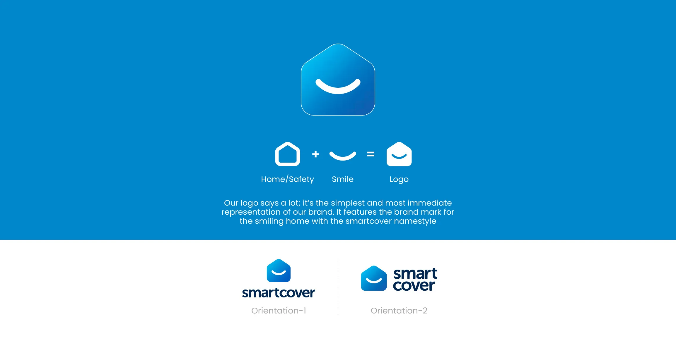
We took a minimalist approach to the logo design, aiming to convey a lot with just a few elements. The smile encased within a house evokes a sense of positivity and reassurance.
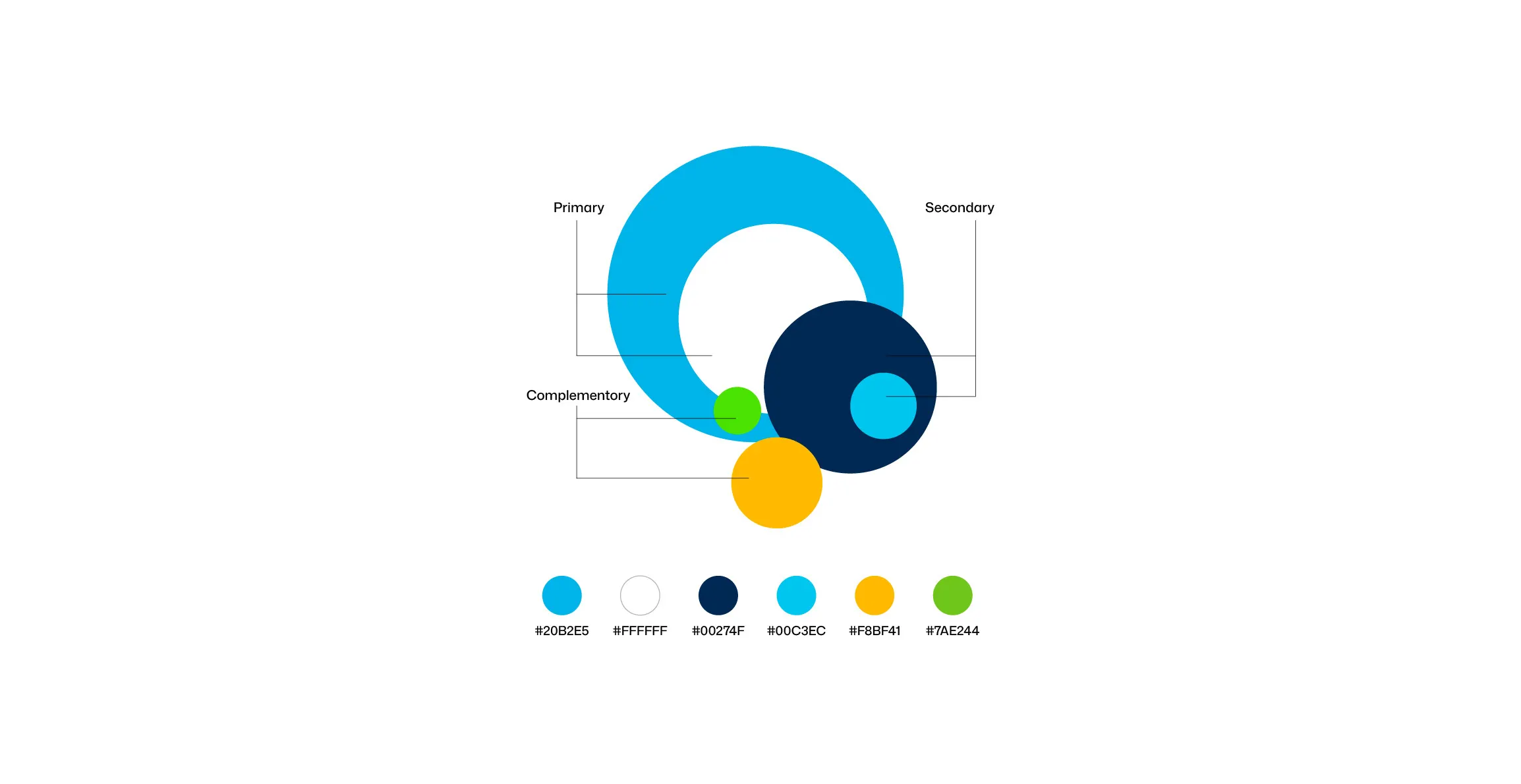
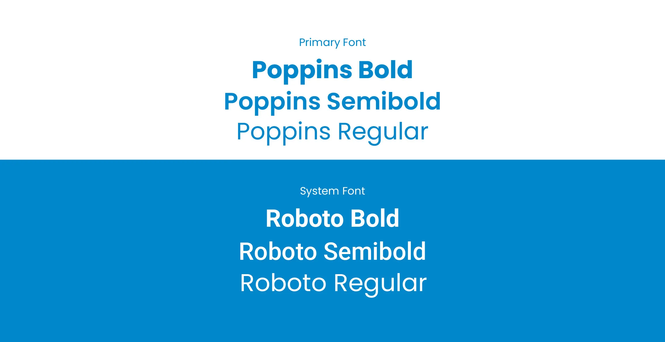
The palette reflects Smart Cover’s insightful and proactive approach. The bright blue to navy gradient represents reliability and the yellow accents add optimism. The typography consists of a bold primary typeface and a versatile secondary typeface to enhance readability and reinforce brand recognition.
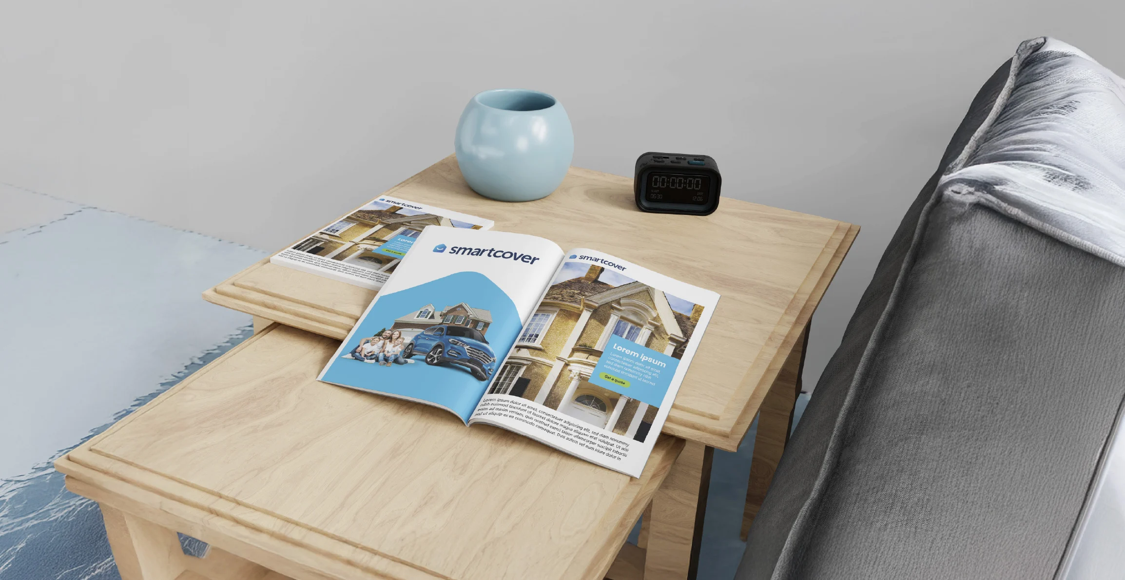
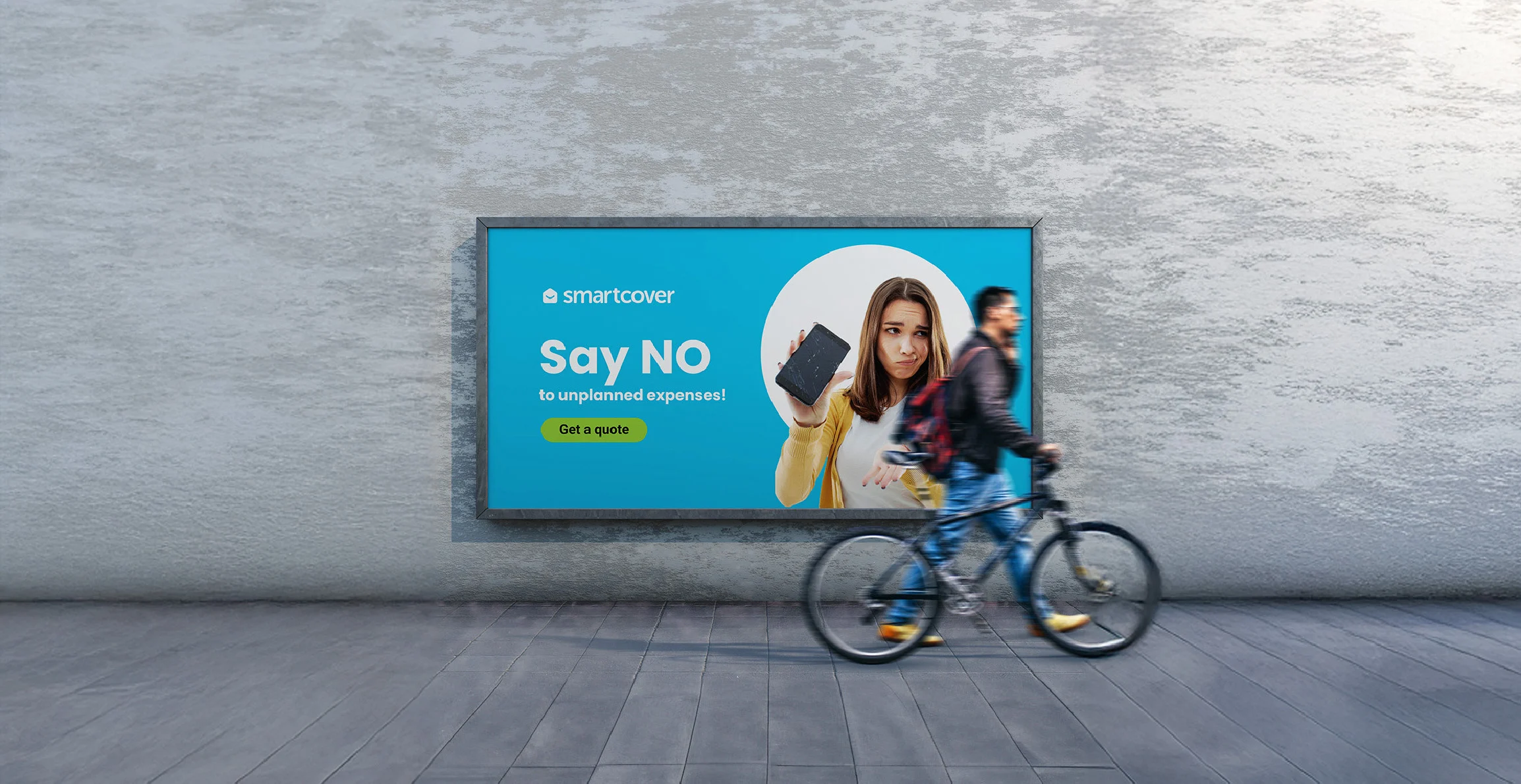
Together, these elements forge a brand identity that feels contemporary, trustworthy, and warm. We incorporated human faces into the visual language, with an aim to make Smart Cover come across as more approachable and relatable.

The exploration never ends. Dive into more case studies and discover how we help brands navigate the digital landscape to reach new heights through immersive experiences.