Good Greed

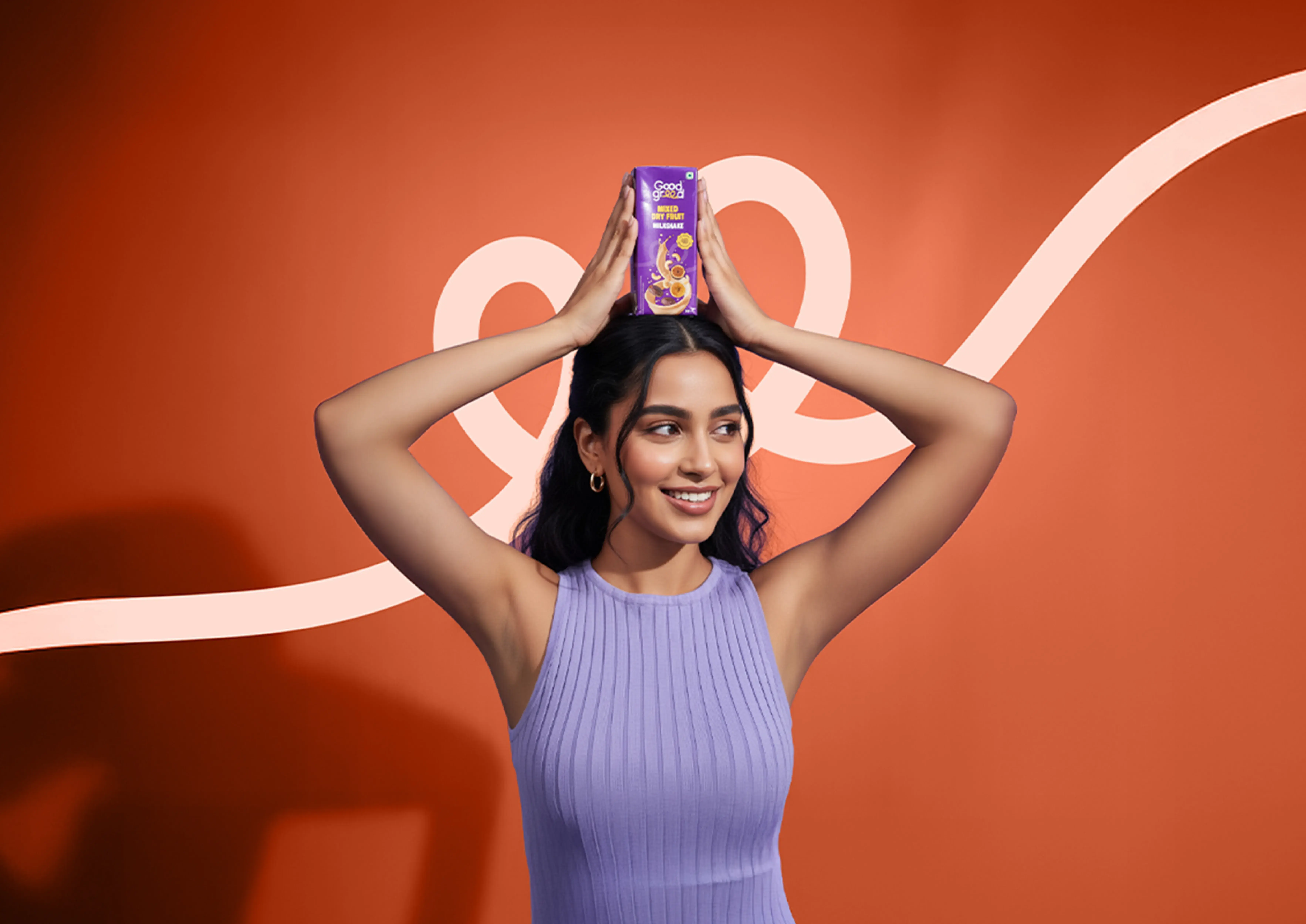
Good Greed is a healthy indulgence brand that redefines wellness by proving that craving more can be a good thing when it's rooted in joy and nourishment. Scratchpad partnered with the brand to build its identity from the ground up, crafting a distinctive visual system that brought its philosophy to life across branding, packaging, digital, and every customer touchpoint.

wORK SPECS
Icon
Client
Good Greed
Icon
Year
2025
Icon
Scope
Branding & Packaging

Logo Design

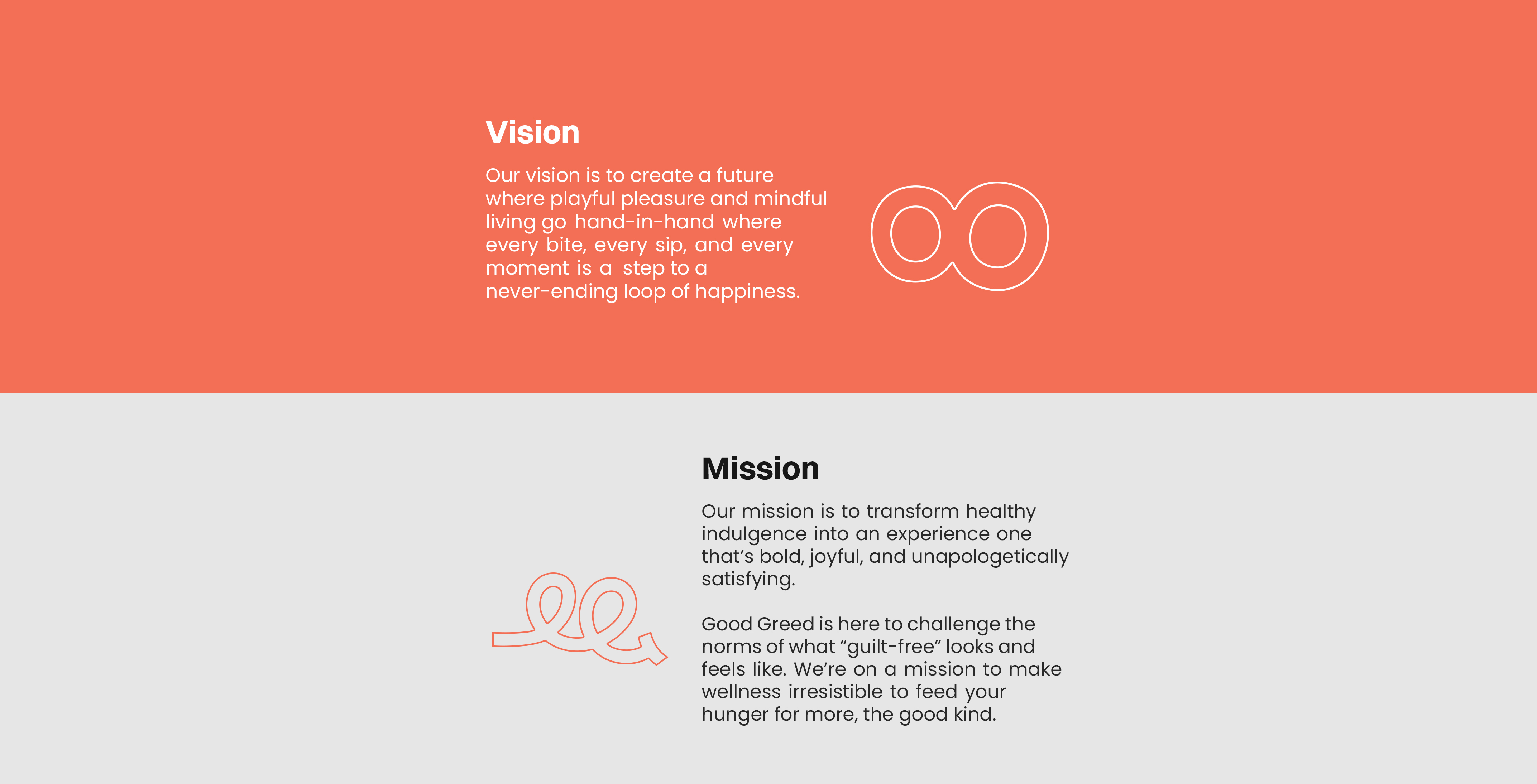
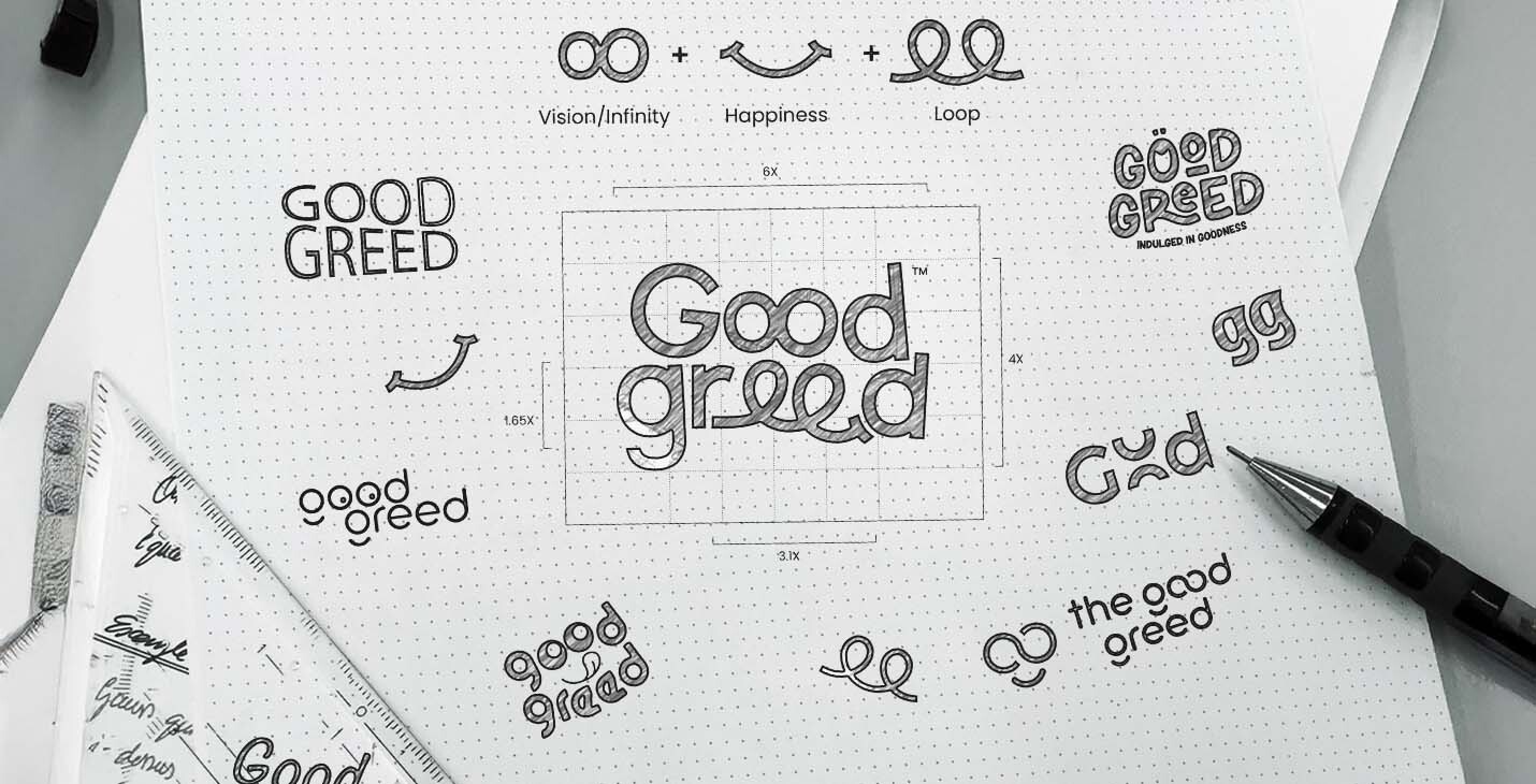
The Good Greed logo is built around the “loop of happiness”, a smooth, continuous stroke that symbolizes endless joy, guilt-free indulgence, and the simple goodness of savoring life’s little treats. Flowing seamlessly into a smile, the loop reflects our belief that every sip, bite, or moment of delight leads naturally to the next, creating an unbroken journey of satisfaction and warmth.
Color palette & Typography

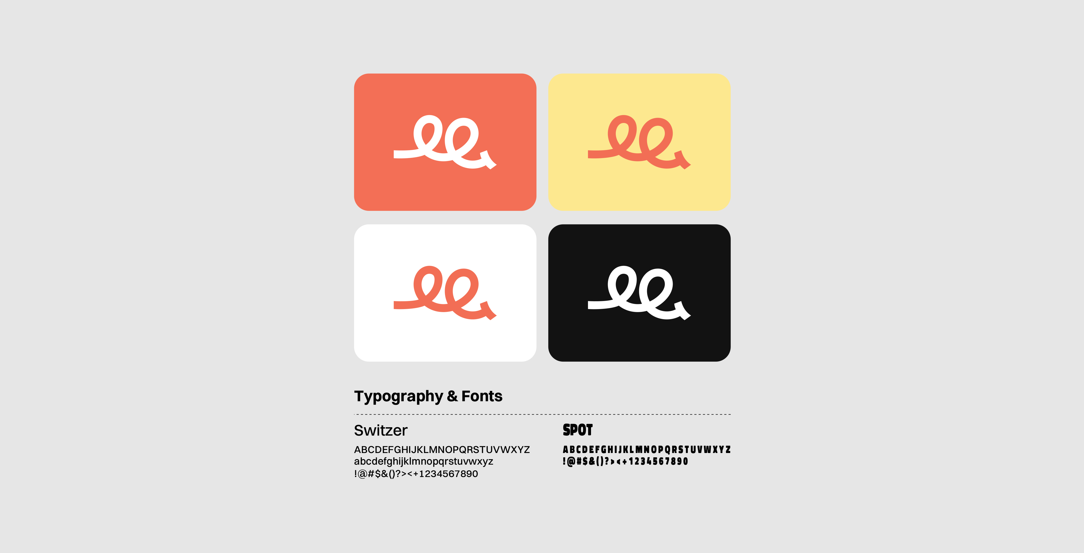
The custom typography of Good Greed transforms sharp edges into smooth curves, creating a look that feels approachable, natural, and welcoming. These flowing forms echo the optimistic brand identity, showing that indulgence can be both delightful and nourishing. It ensures a distinct and memorable presence across every platform.

Seamless Packaging

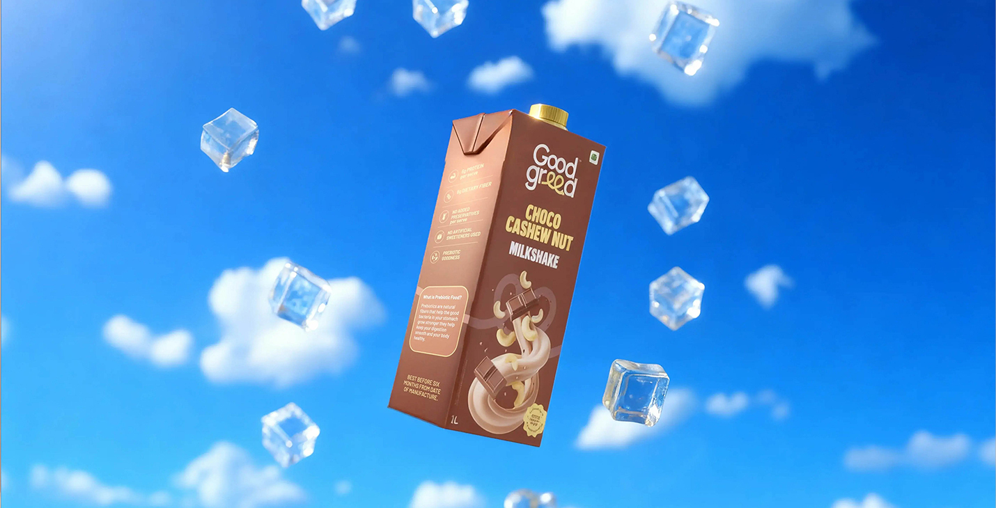
The Good Greed packaging is designed to feel as good as it looks. It’s smooth, balanced, and satisfying in your hands. To ensure it stands out on crowded retail shelves and in refrigerators, we introduced a vibrant colour palette that makes every flavour instantly recognisable. More than just a wrapper, it’s an extension of the happiness our brand stands for.

‍